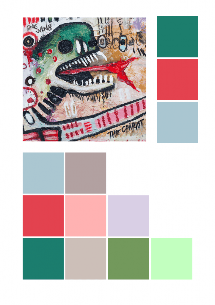
For week two we looked into colour and colour planning for our work. Spectrum analysis and the difference between RGB and CMYK. We had to pick a piece of art we like and pull out the palette for it.
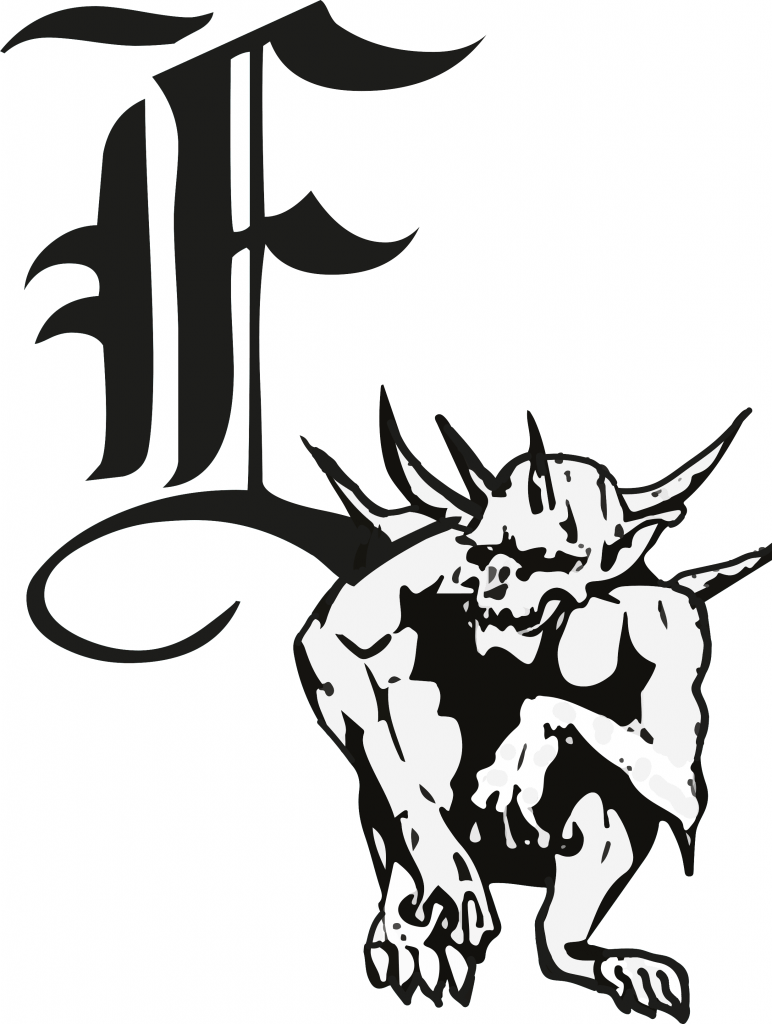
After looking into architecture as the brief dictates the company want to represent. I looked into Gothic style and gothic architecture mainly the Gargoyles that sit along side the roofs of buildings. I incorporated the letter E for Enganche and this is a rough draft I created.
However after feedback and looking more into it as a corporate image i’ve decided to head in another direction.
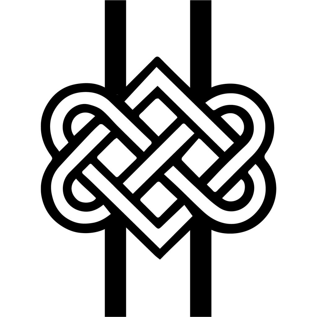
Still aiming to have the ominous look however I looked into older symbols that have an image of strength and unity yet could still represent a company. I found an image of Buddhist knot and after some manipulation produced this logo.
This I can see being used as a letter head, on the side of building, engraved in stone or on the front of a work portfolio. So as a corporate brand I can see it working. Going to apply it to some mock ups during the week and find a font to write Enganche.

