Evaluation

Overall these two projects have forced me to learn and stretched me as a designer and it has been great. Arguing with the software till I figured out what I had done wrong, helping fellow designers and in turn them helping me. Completely changing my ideas last minute and still managing to pull it off, with two sleepless nights but still, really enjoyed these projects.


Typography

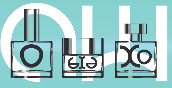
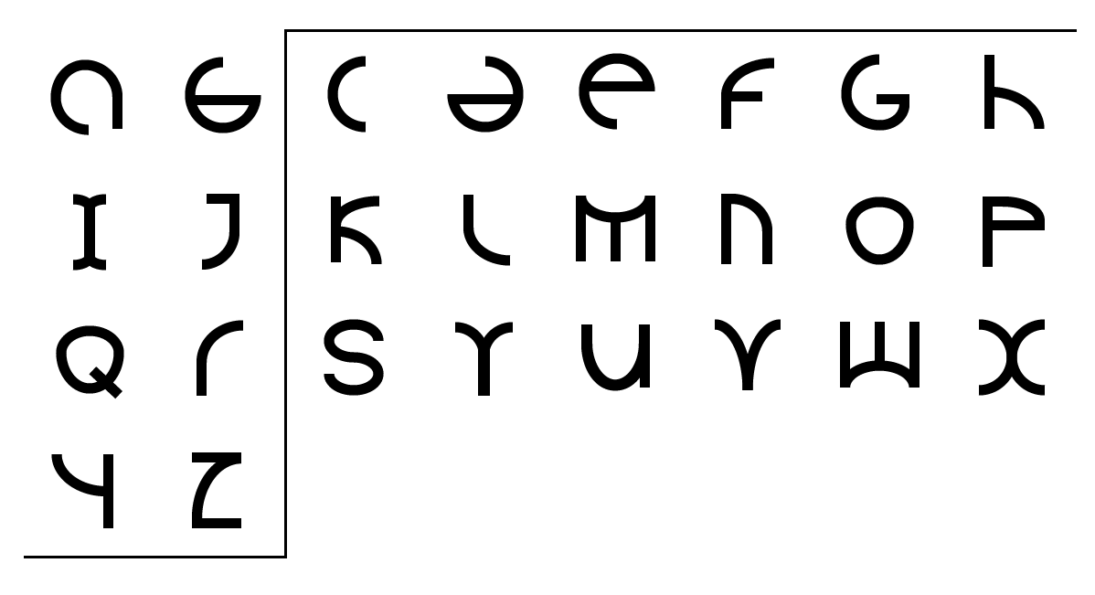
Obviously the one I changed most from initial concepts however i’m happy to have kept the basic idea there, there are still runic elements if you look closely throughout. I have spent man hours tweaking tiny individual parts of each letter form and I had to draw a line as I was becoming obsessive and spent a full afternoon just making the tiniest adjustments which it was worth it but I think it was getting to a point where it was just me that was noticing. Chris helped during session as a fresh set of eyes and from a teaching perspective to show me what he could see and adjustments were made accordingly. I’m really happy with the final design of my typeface and I honestly could see it applied to several more medium than just perfume and art poster that I chose. It would work well as advertisement, business font or even on an album cover. The only thing I’d change is giving myself more time to refine to a point that its perfect to me however I started it late and i’m proud of what I managed to do within the two weeks the idea came to be.
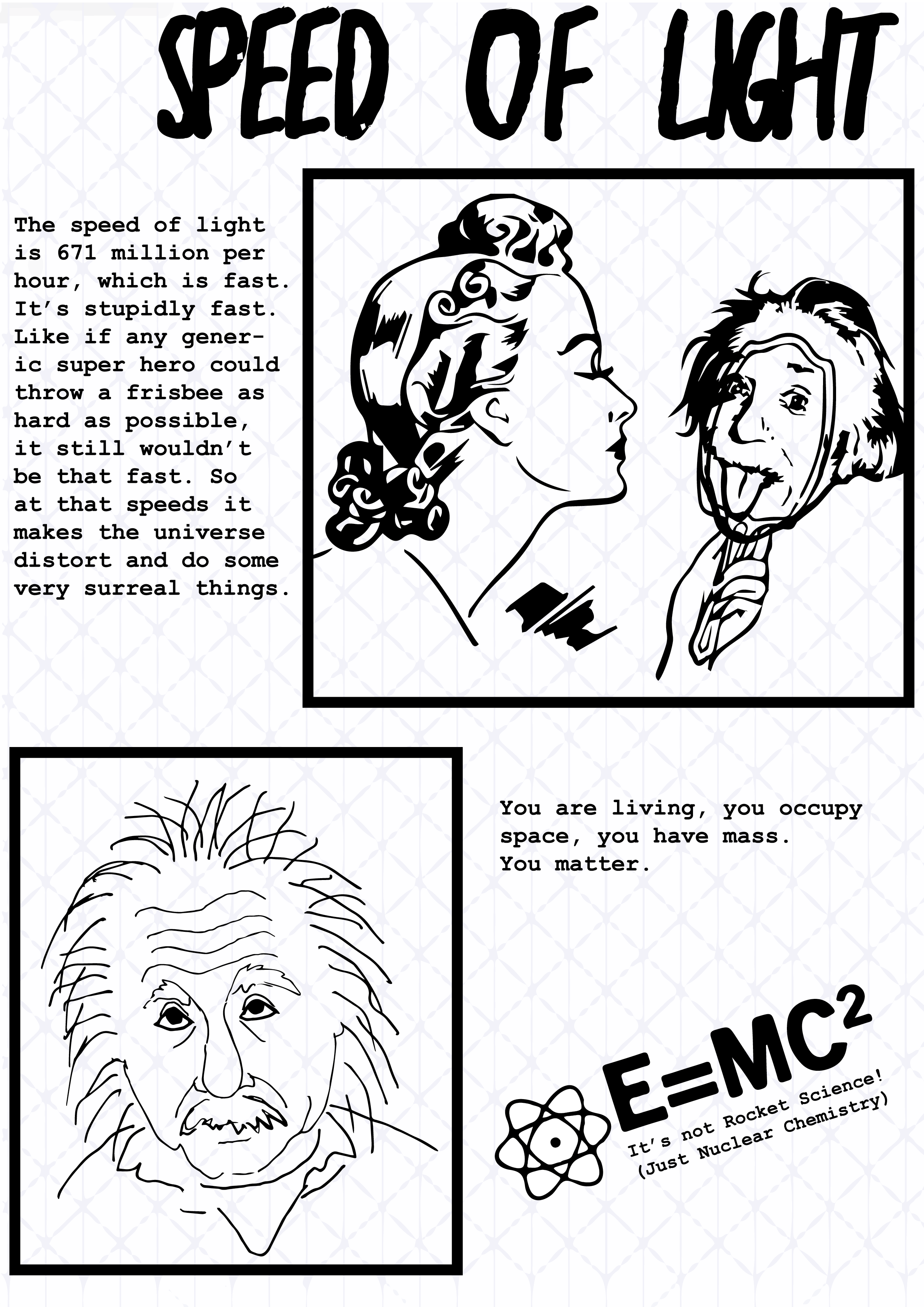
 

Info-graphic

Initially causing me bother for weeks just from not having an idea that made me want to work, I felt stagnant with this but once my idea was locked in it was fine.  I feel my strength was keeping the style consistent however my weakness was layout, I had it in my head but couldn’t quite translate to paper/screen. I feel this is a time sensitive matter though, structure and layout and with multiple deadlines looming, priorities got re arranged. Not an excuse just reality and a fault on my part. Time management will be a major focus for me next semester.

Week 12: Updated app and final typography work.

The app was a simple matter of looking at it as an app for mobile devices rather than just a screen size, i’m quite happy with the result. Obvious pull from a looney tunes inspiration for the first screen and the rest although with placeholder text I feel the design is there.

app app2 app3


And finally with my font here is the final practical applications and typographic alphabet.

practical_perfume practical_poster


blog_Newfont

Week 11: Presentation, Info Graphic and entirely new font

Presenting the info graphic went well, I got much needed feedback as although i finally had an idea I was struggling to fully work with it, in terms of multi format visualization anyway. Below is how the comic would look on desktop and you would just click and itd scroll to the next page.

IMG_8987 Zine12 Zine13 Zine14

And for the poster I tried to condense it but the main feedback was that it was still too word focused and not enough graphic work going on.

poster

And finally my mobile version which was just an reiteration of the webcomic but in a different format. Not really much to behold and i’m going to change it entirely after feedback.

mobile

Also at around midnight the night before presentation upon reviewing my font I decided I no longer like it whatsoever and started a brand new fresh font, so I didn’t sleep before the presentation but I think I still managed to present fairly well. My new font still has basis in the viking realm but is a much more clinical and flat approach. Below isn’t the image I showed in the presentation however it is the very very first mock up. Obviously no where near complete but a slight feel can be got from it of what i’m aiming for. The reason i’m not uploading the one from the presentation is, I aren’t happy with it and am currently refining it and probably will be till the very last moment before upload.

desad

Week 10: Info-graphic idea set finally

After discussing my issue with our teacher Chris and he looked at some of my mock up vectors he began to structure it into a comic book front page and then it suddenly all clicked. I’m now doing a web comic style graphic novel that is sarcastic and has some facts about Einstein but the facts are looked at in a different way, a more cynical approach to the information and task. This isn’t a reflection of my feelings towards the task though its simply because the web comics that interest me and I read are all in a sarcastic, cynical and simple lay out and style.

Initial mock up of the front cover, i’ve used the term “zine” cause I want it to sound pretentious and yet underground at the same time.

IMG_8987