Childrens Book: Week Ten – Change of focus


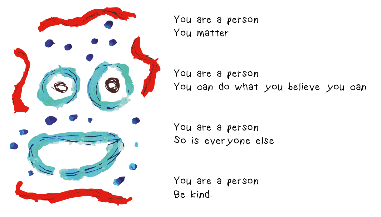
After experimenting with more painted faces and getting further into my idea for the “Stop being the print” I found myself struggling to find things relate able or approachable for children or for adults to read to children.

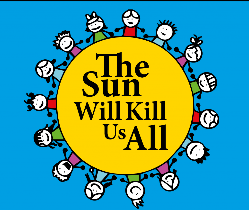
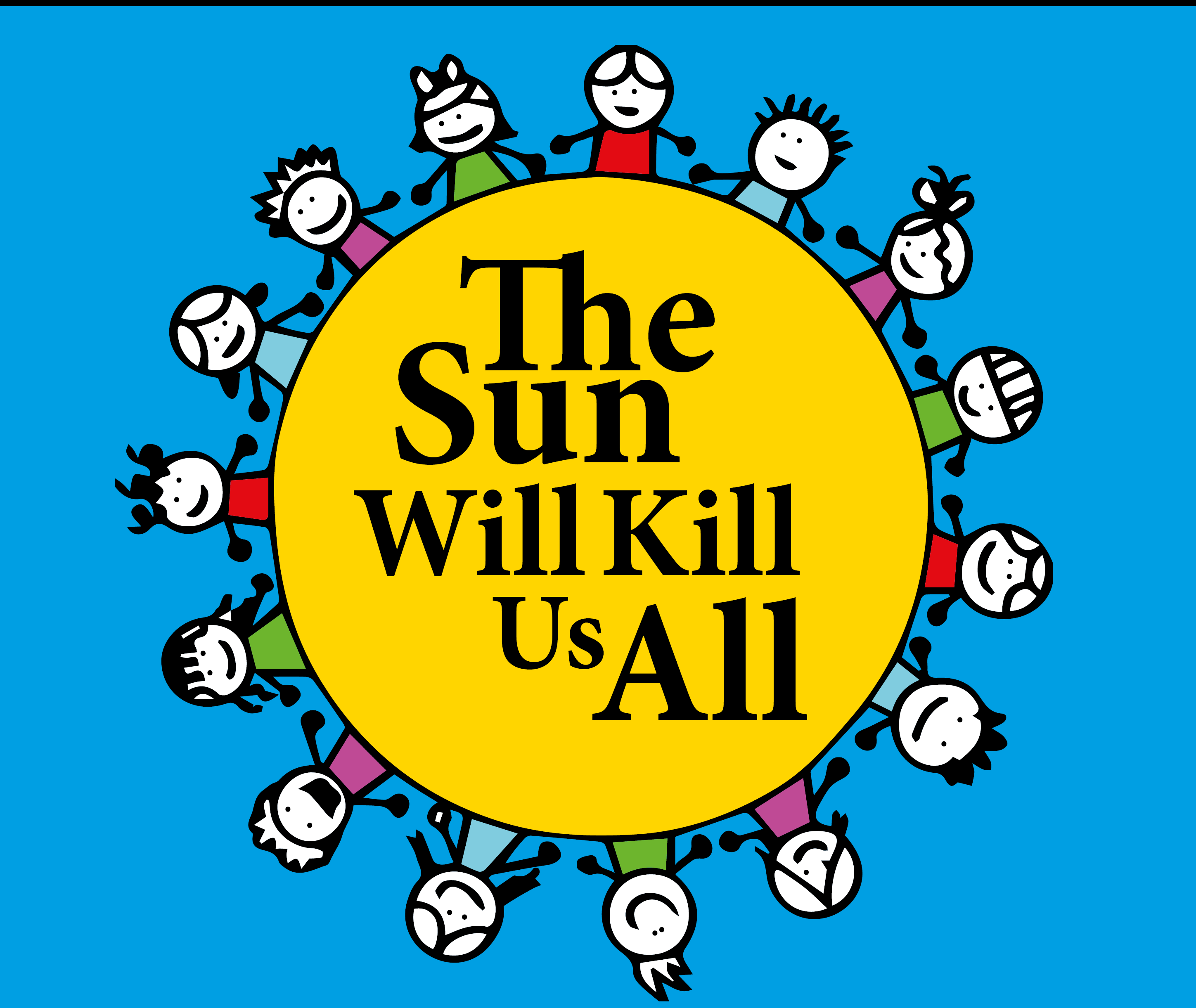
I decided to move onto a topic that is widely misunderstood Nihilism. Nihilism is surrounded by a conception of it being negative when it is in fact positive and a happy thing.


I want to approach the topic as in these words will be read to the children by their parents/carers in a soft calm voice and the messages will sink in as something positive.


Basically Nihilism for children.


bgasa

Childrens Book: Week Six – Initial Concepts

Before Christmas I mocked up a very quick low quality idea for this project. Under the title of “Your Parents Aren’t God” the initial idea was to deal with explaining how your parents are just people like yourself and that their relationship was just two people. Separating the idea of parents being one definitive unit forever. Dealing with early ideas of separation anxiety children may have during a period of parents separation or divorce. However i’m still at ends wether or not to continue with this or work on something else.

12072832_949223455149264_8198931046976331349_n

Brand Identity: Week Five – Branding Identity Start

After feedback in workshop I gained more focus on the key elements of my work I should focus on, the subtlety, anonymity and general sneakiness of the company I’ve chosen. As if most of it is always shrouded. With help from Chris the start of my identity branding book began to form. Aiming to have this document look like something that would be slid over a table at a sort of not so public meeting. I’ve chosen to call each section “The Rule of” following its relevant section title, to play into the idea of this being an older and more private organisation. Still keeping the buddhist knot as my main brand image as I like that it represents unity and that’s what this company is hoping to do, unify themselves with arts and architecture awards. Yet the knot still looks quite ominous, especially on a black background. Also chosen to drop “Venture Capital” from the main part of the branding just to give it even more of an ominous feel.


eg eg2 eg3 eg4 eg5 eg6