Children book final.
Corporate branding final.
Finished projects for both briefs.
Children book final.
Corporate branding final.
Finished projects for both briefs.
After several ideas not inspiring me to carry forward I finally settled on moving forward with my current plan.
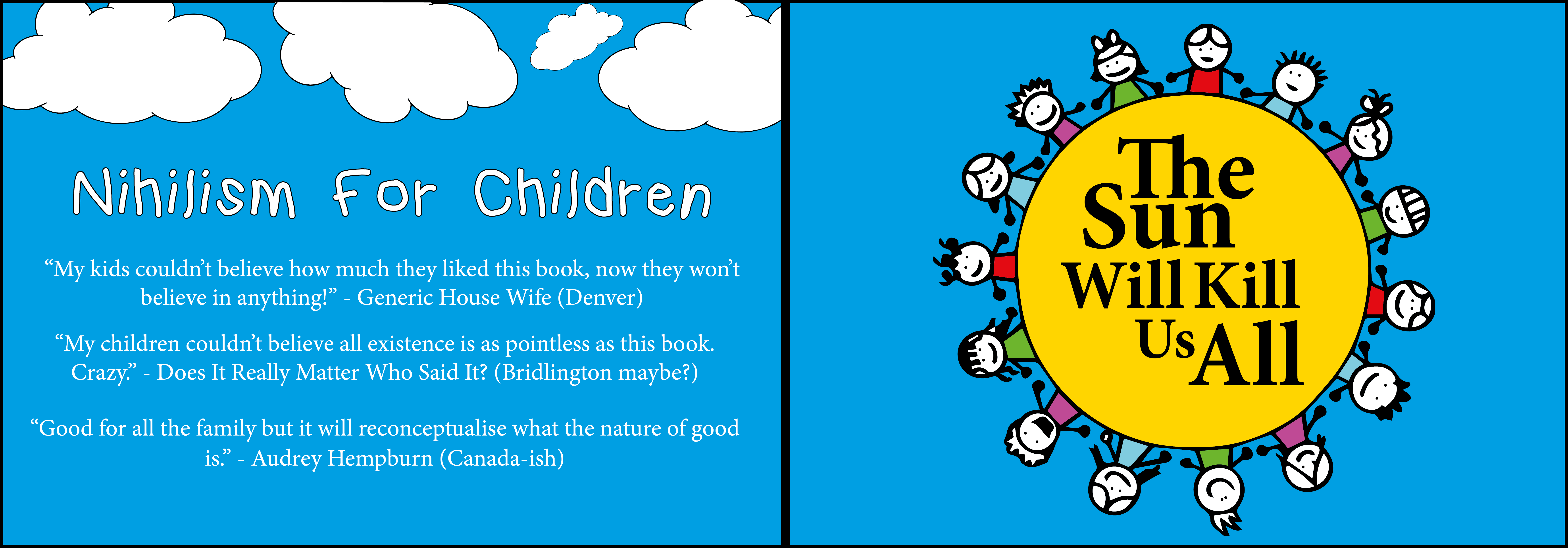
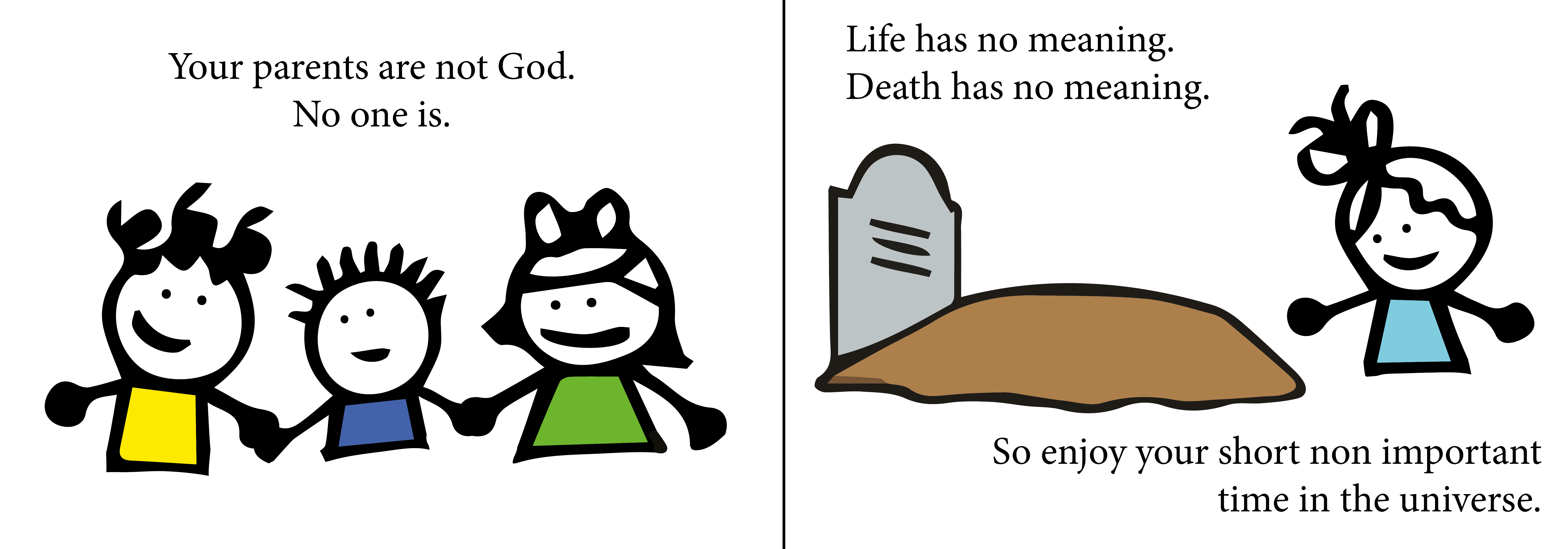
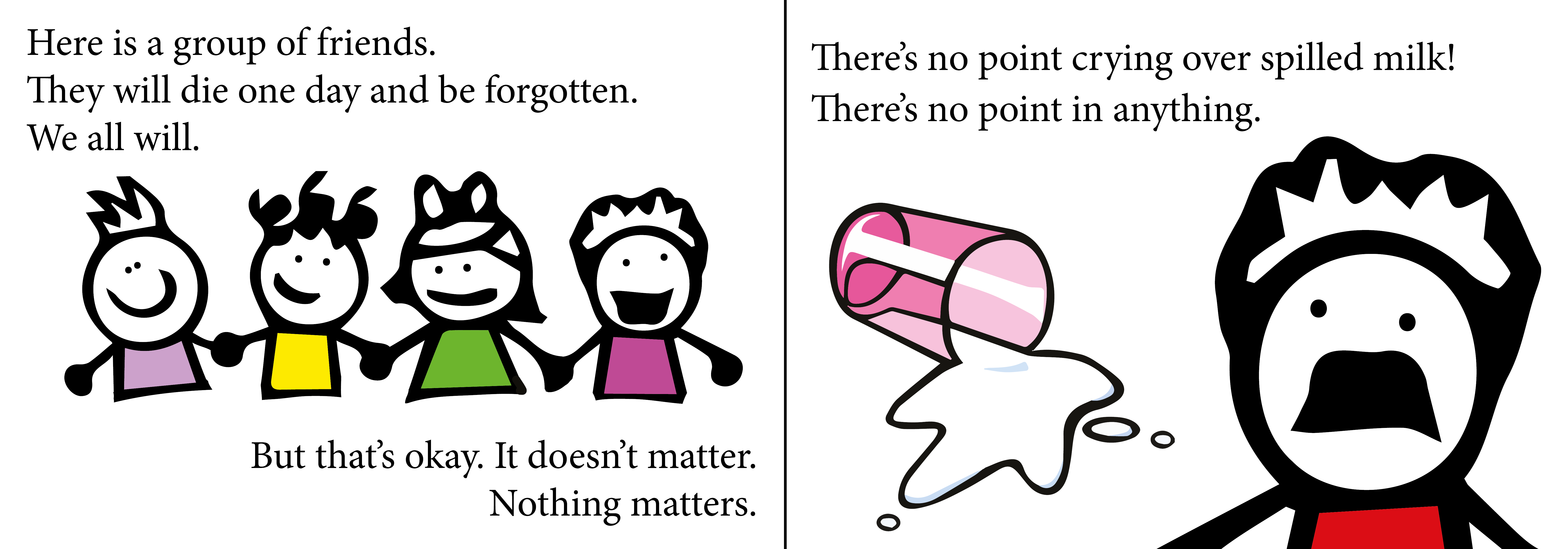
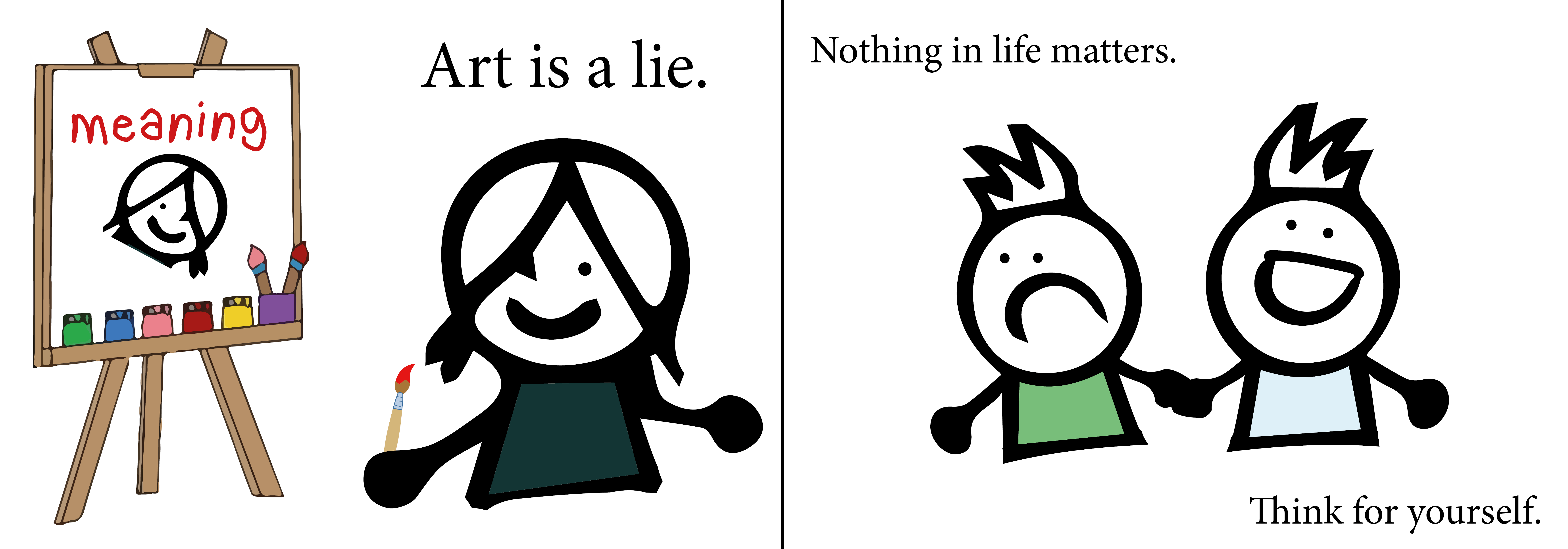
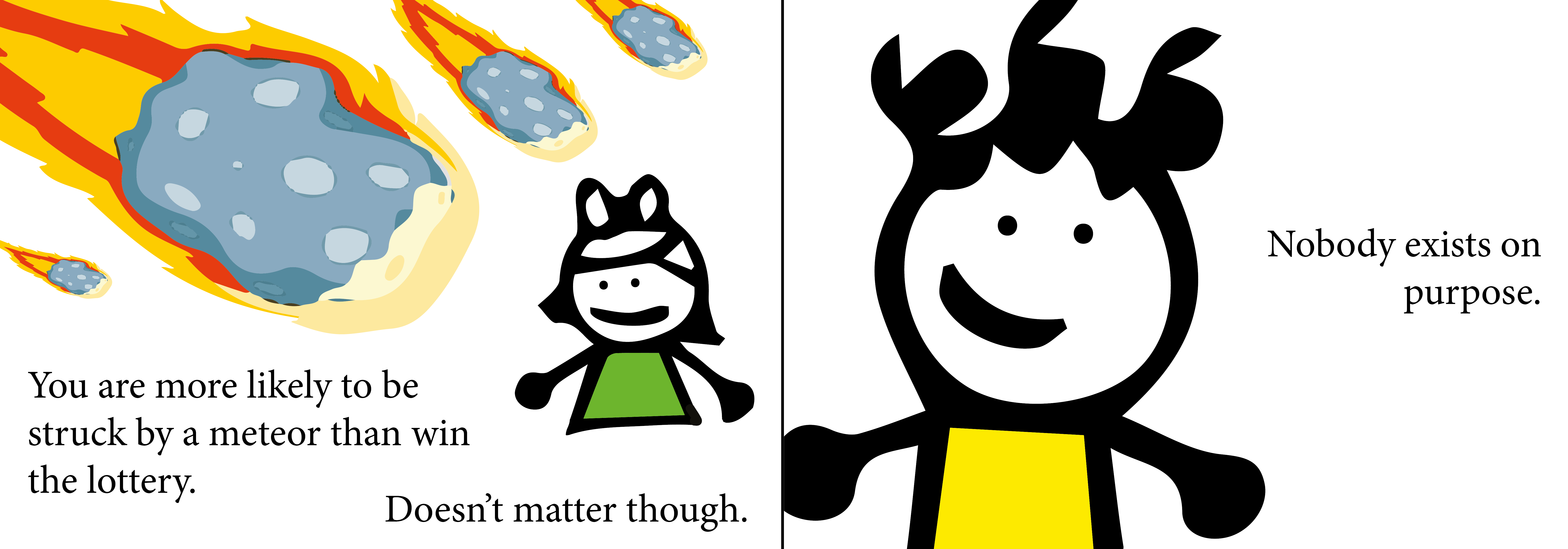
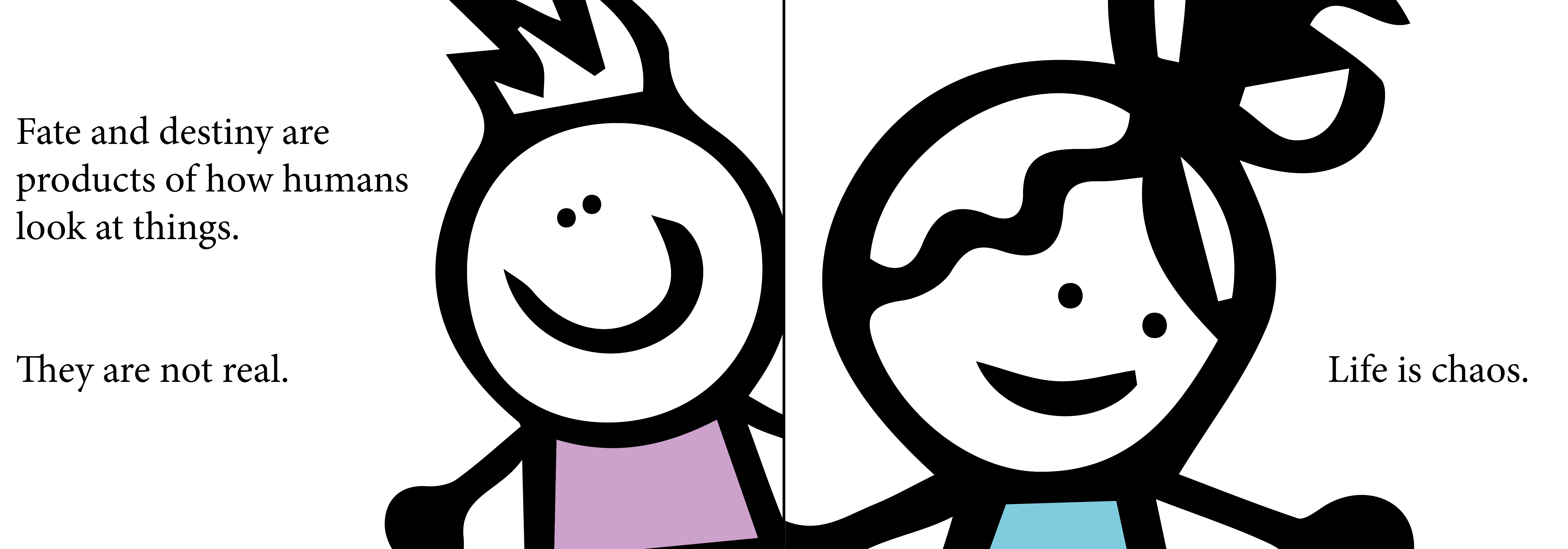
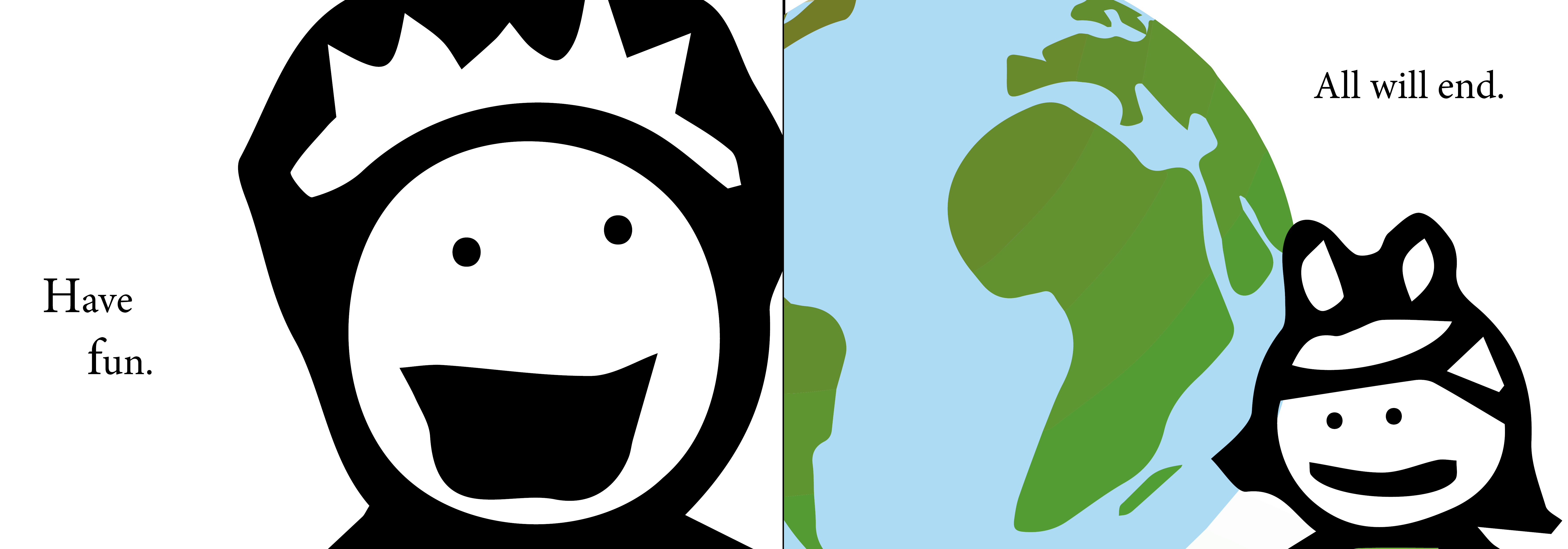
My book is focusing on inspiring originality within its audience and focusing more on people being different and being talented in different fields but it all being okay. Focus on the idea that if you’re good at maths or good at art both are valid and neither is more important.
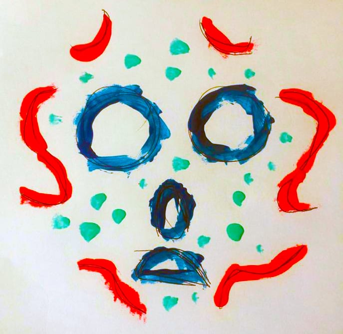
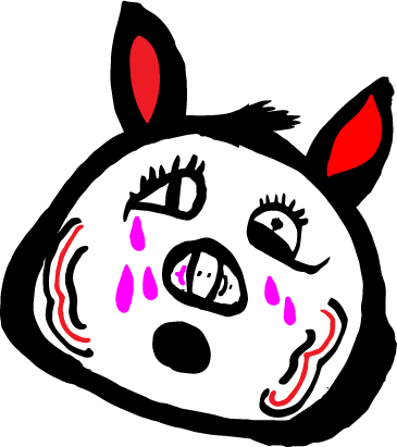
Due to restrictions of available materials I used some borrowed nail polish and painted over a basic outline of a face like shape.
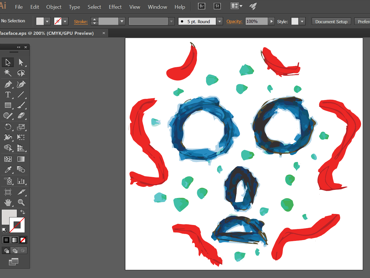
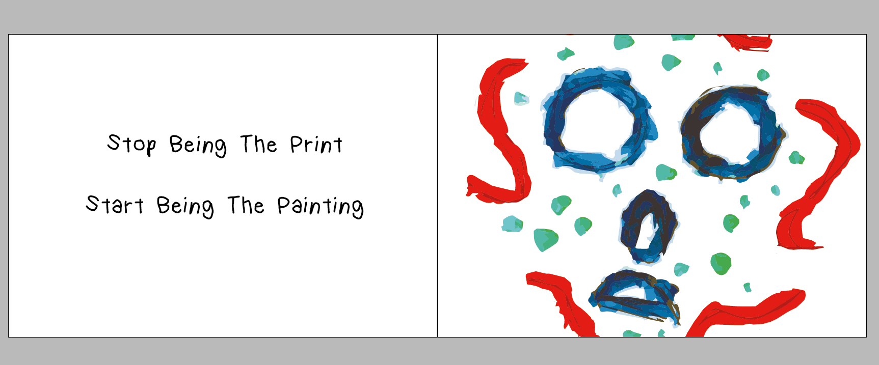
Then I went onto illustrator and began fixing and cleaning up the image to use on front cover. Then created a rough draft of the front cover.
I’ve chosen to go for full A4 landscape format pages for the book and that this is the first draft. The font I’ve chosen something approachable an recognizable for children. Simple and friendly.
The title is reference to more pushing towards inspiring originality rather than copying/following what is considered normal or regular.
After experimenting with some drawing I have decided to just use a 4 colour system of Black, white, pink and red.
Here is a stylised sketch of what I have in mind. I tried converting it on illustrator however it proved some issues so will work on that in my own time.

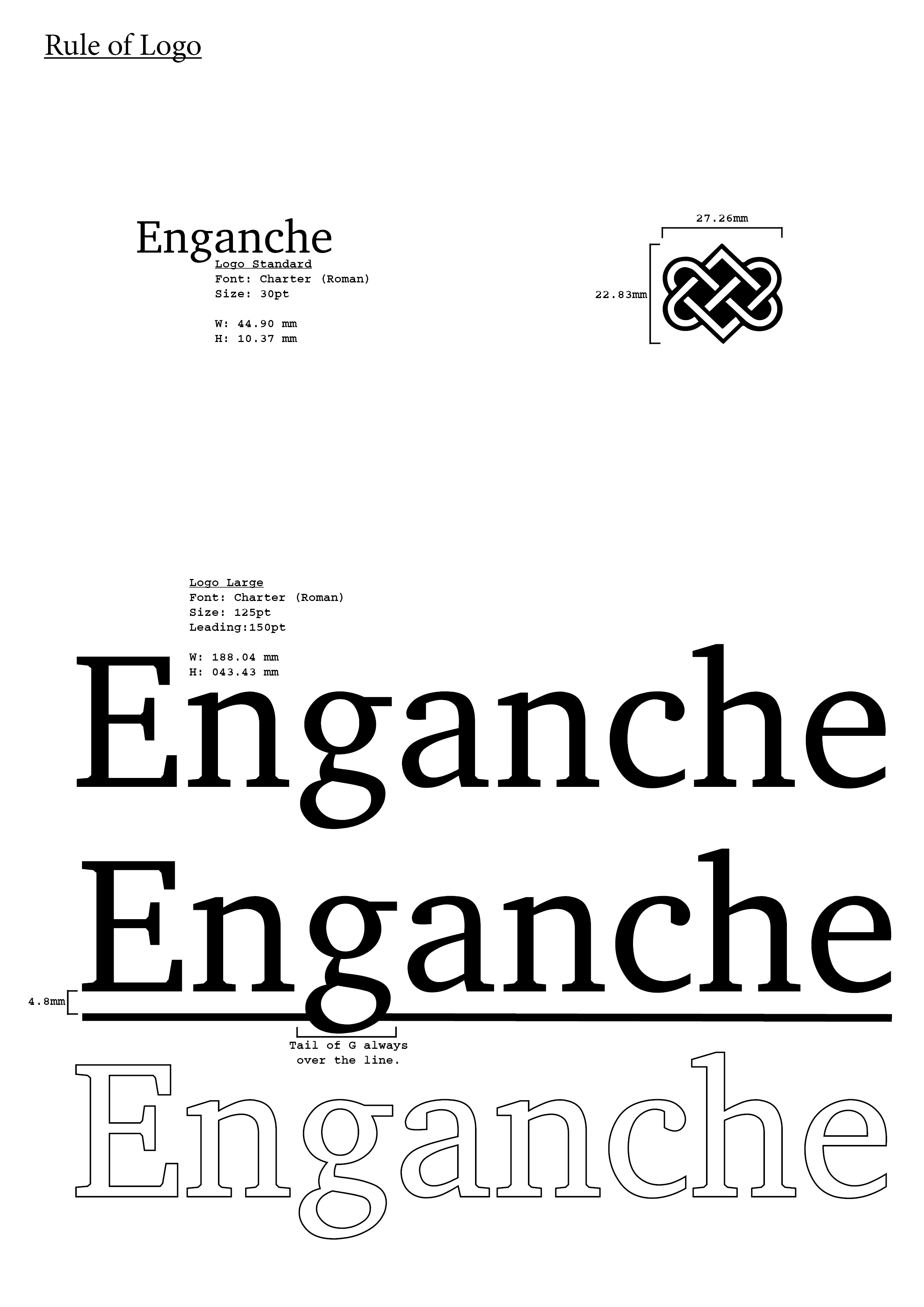
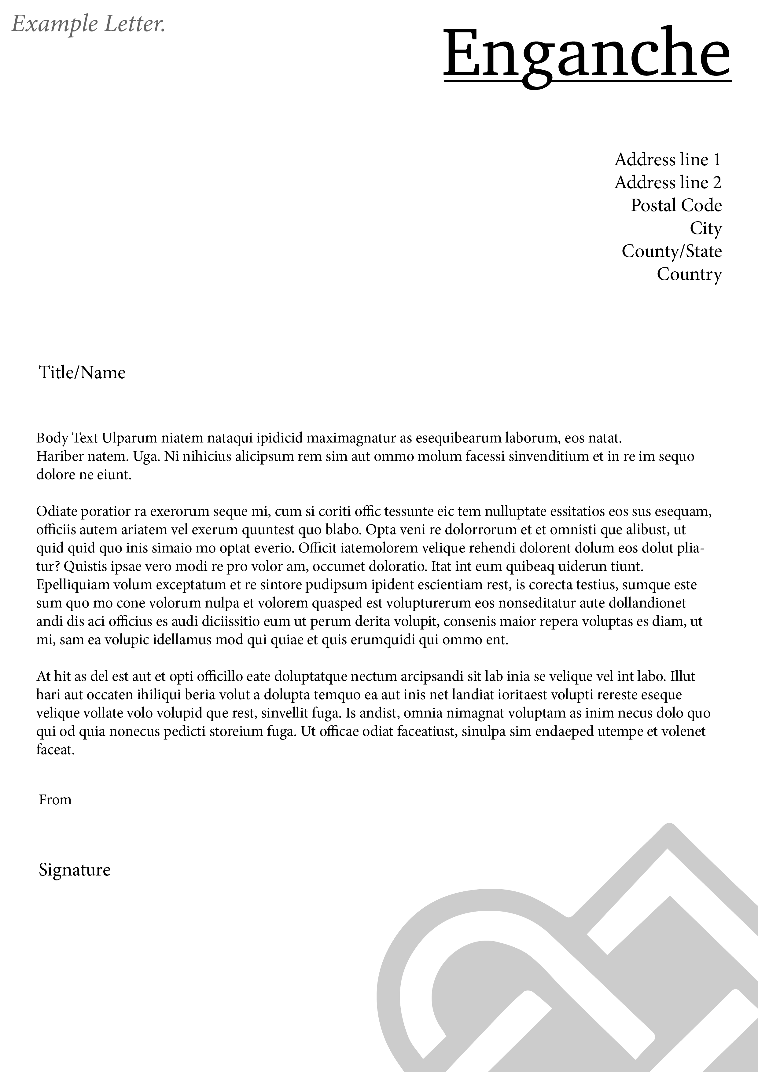
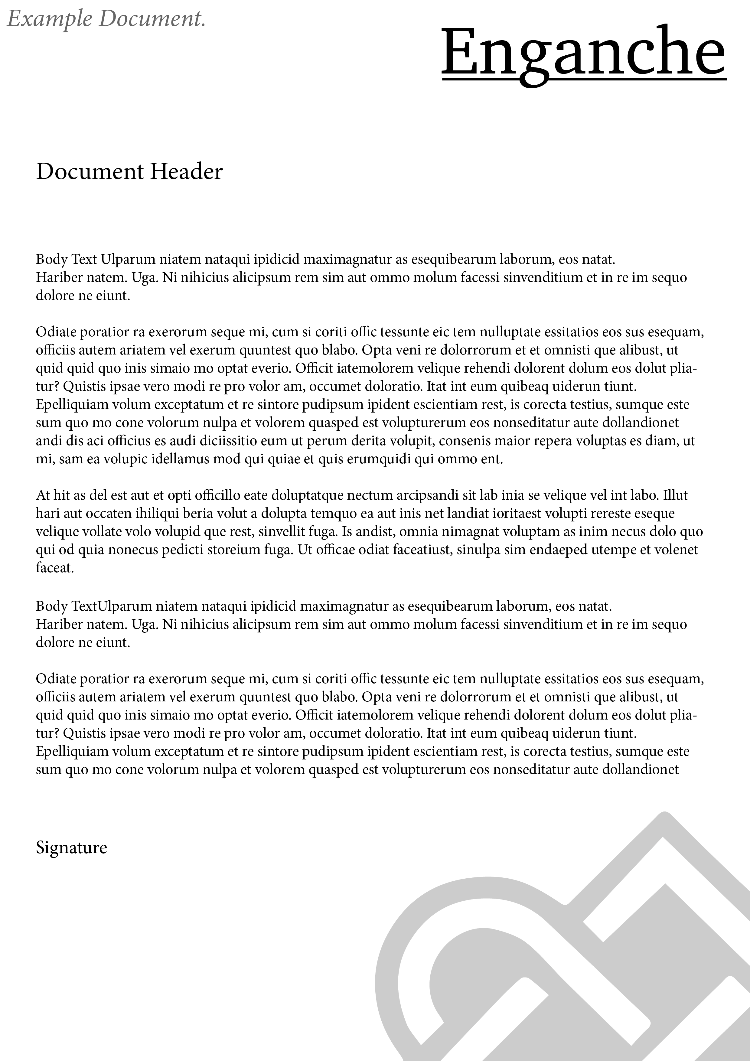
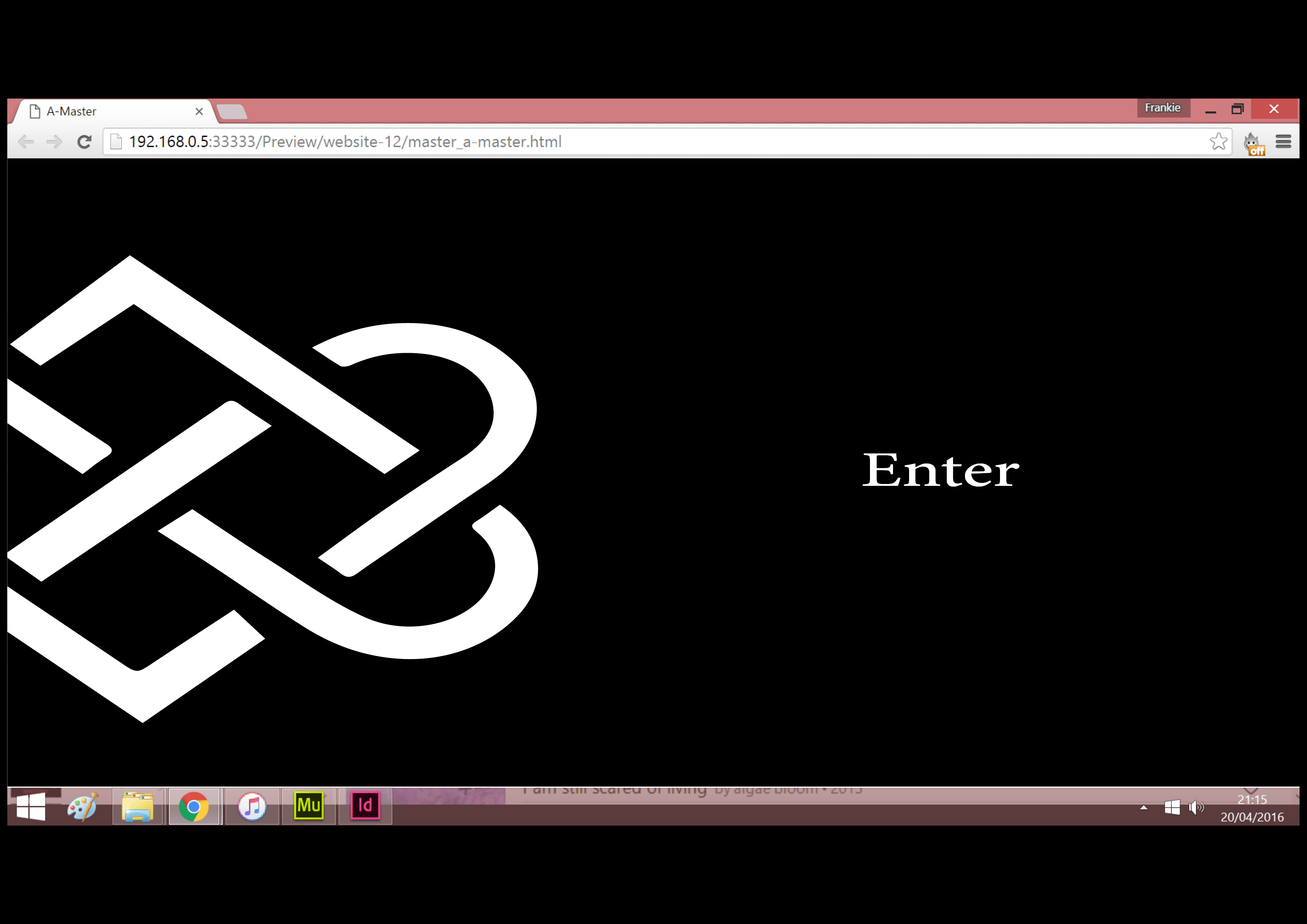
As seen below I decided on title and sub title font for the design and worked more on the actual logo itself. Developing the knot logo more.
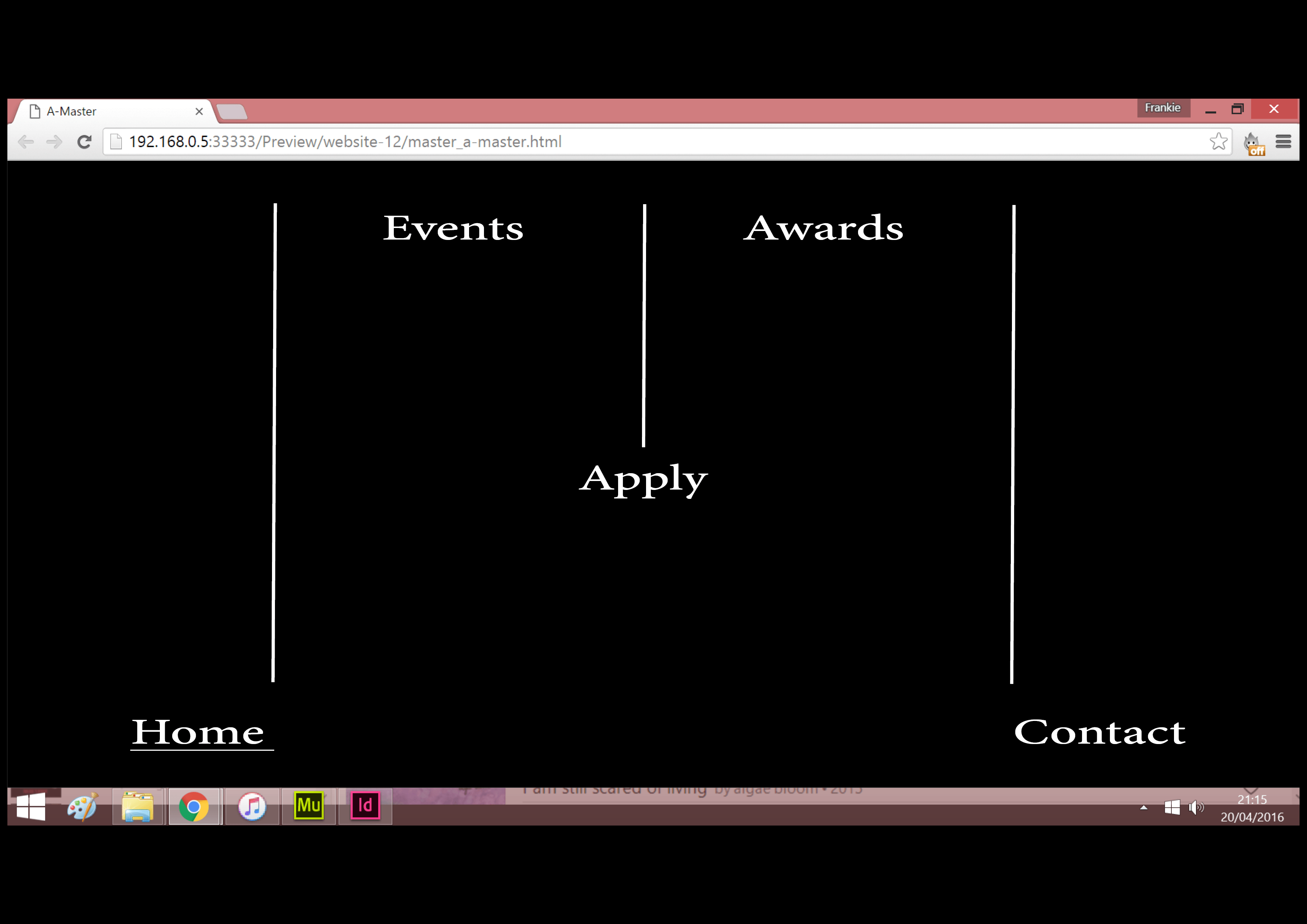
Font choice is down to the straight rigid font as a representation of architecture and the slant more modern font as a representation of the arts which is what the company is asking for.
Still undecided on final colour of knot however shall be working on this during the week.

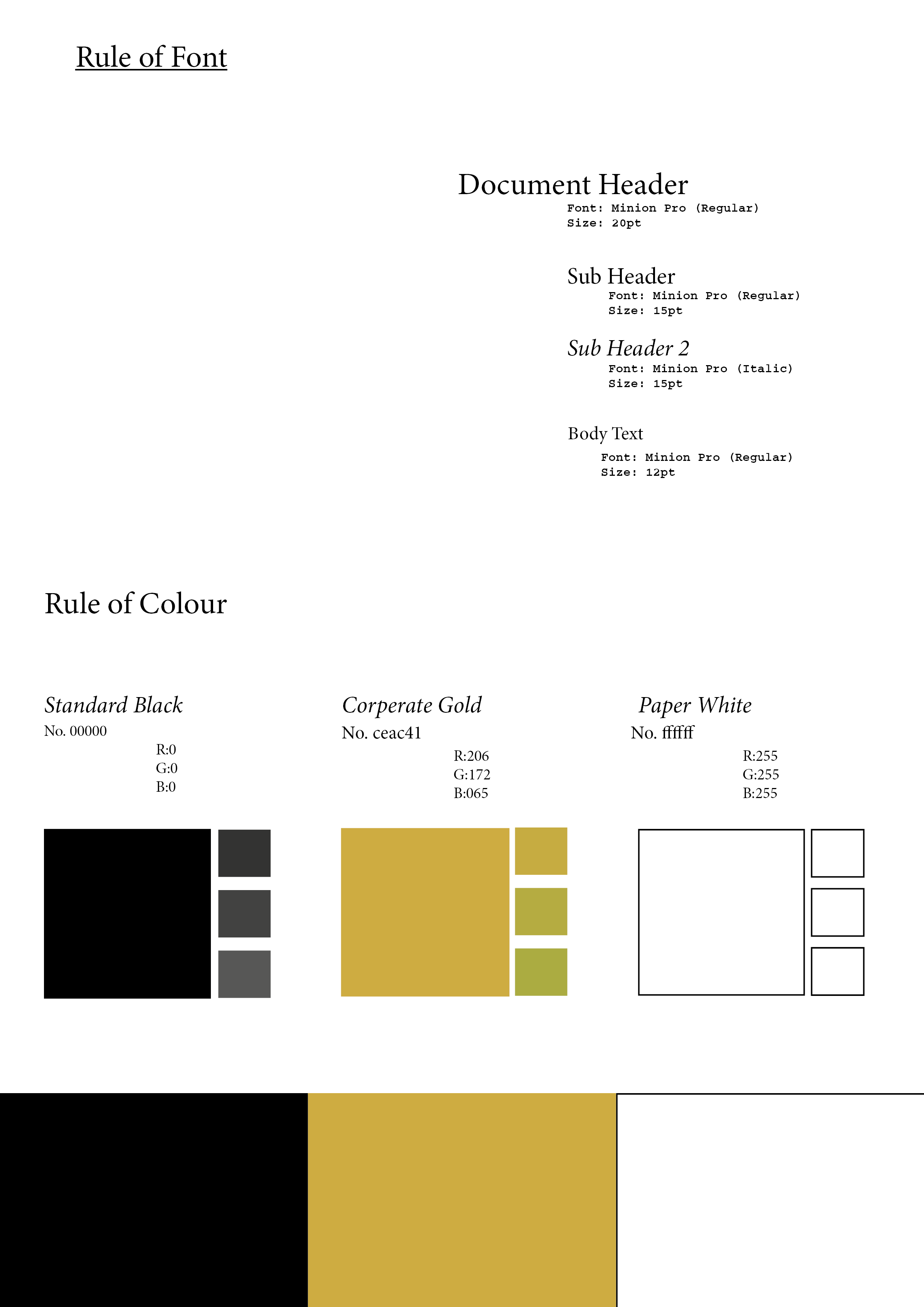
For week two we looked into colour and colour planning for our work. Spectrum analysis and the difference between RGB and CMYK. We had to pick a piece of art we like and pull out the palette for it.

After looking into architecture as the brief dictates the company want to represent. I looked into Gothic style and gothic architecture mainly the Gargoyles that sit along side the roofs of buildings. I incorporated the letter E for Enganche and this is a rough draft I created.

However after feedback and looking more into it as a corporate image i’ve decided to head in another direction.
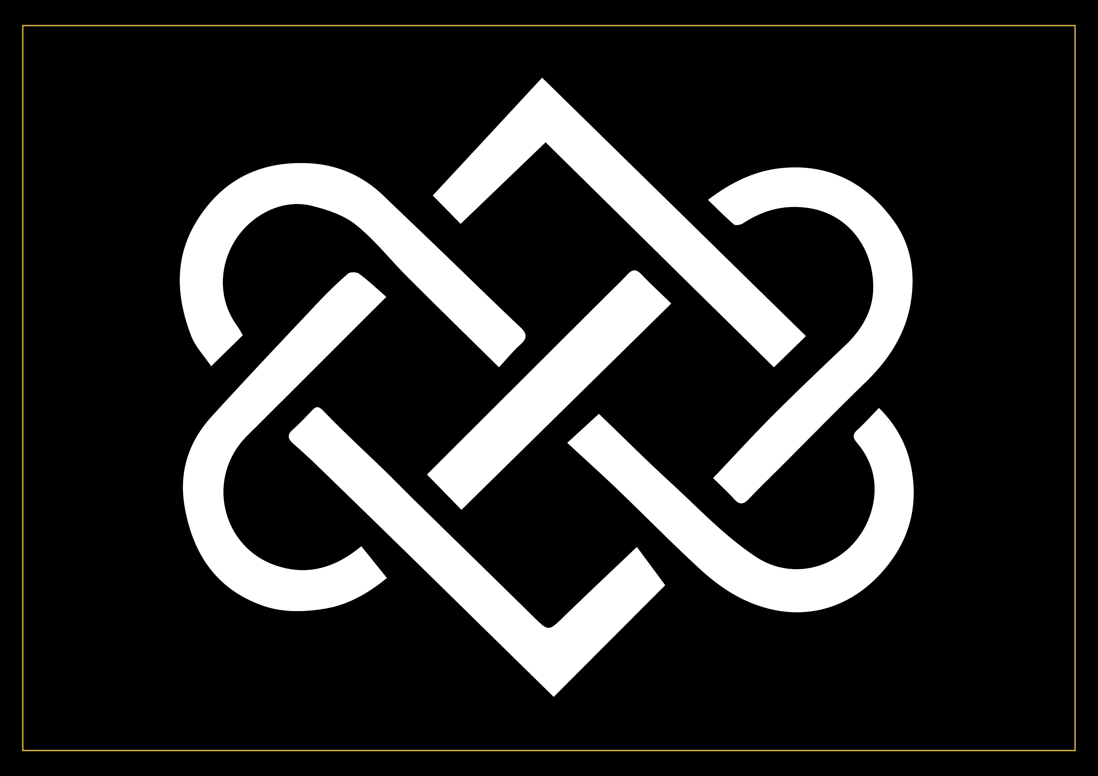
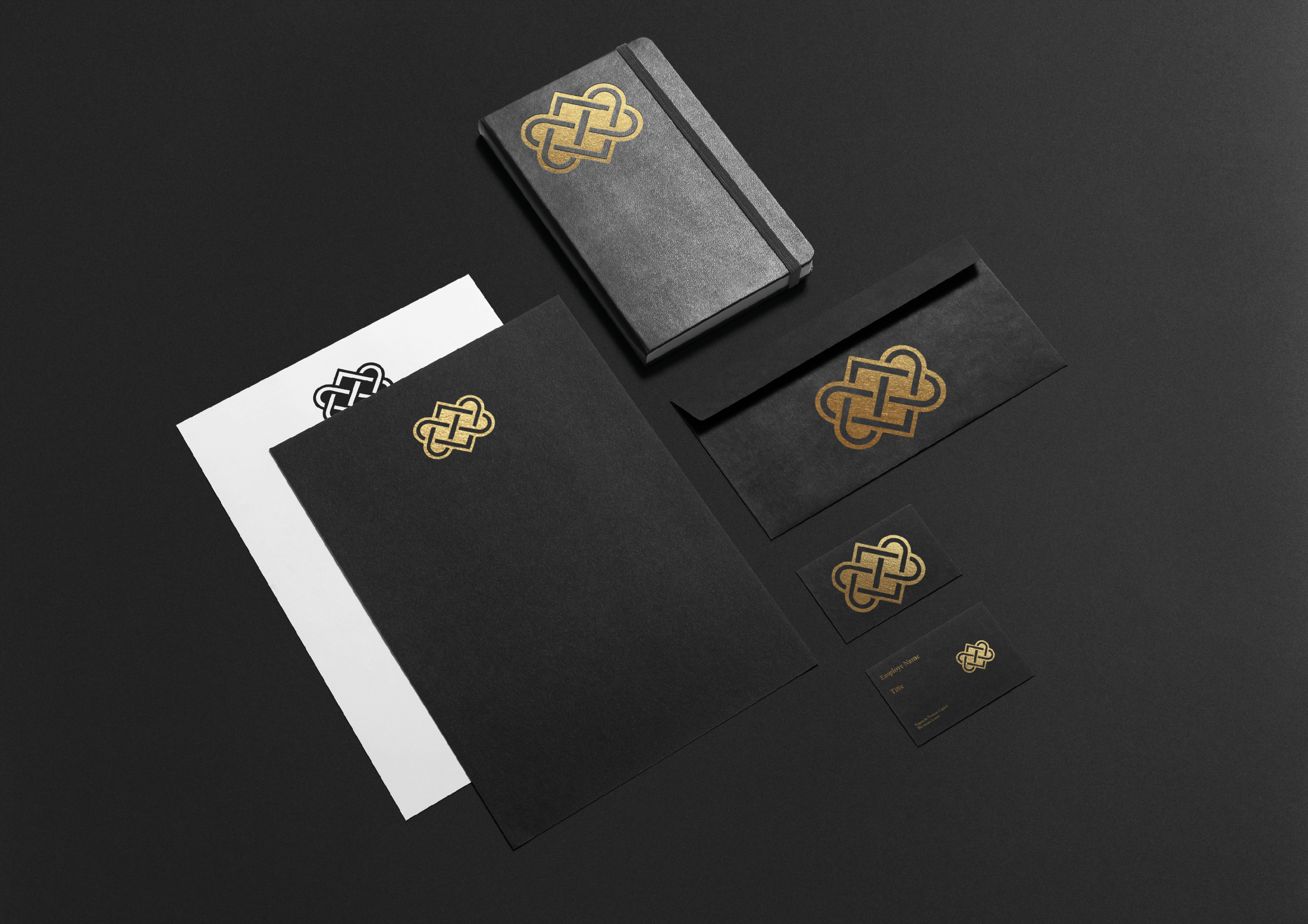
Still aiming to have the ominous look however I looked into older symbols that have an image of strength and unity yet could still represent a company. I found an image of Buddhist knot and after some manipulation produced this logo.

This I can see being used as a letter head, on the side of building, engraved in stone or on the front of a work portfolio. So as a corporate brand I can see it working. Going to apply it to some mock ups during the week and find a font to write Enganche.