Brand Identity: Week Three – Logo and Font Development.

As seen below I decided on title and sub title font for the design and worked more on the actual logo itself. Developing the knot logo more.

Font choice is down to the straight rigid font as a representation of architecture and the slant more modern font as a representation of the arts which is what the company is asking for.

Still undecided on final colour of knot however shall be working on this during the week.


WEEK3

Week 12: Updated app and final typography work.

The app was a simple matter of looking at it as an app for mobile devices rather than just a screen size, i’m quite happy with the result. Obvious pull from a looney tunes inspiration for the first screen and the rest although with placeholder text I feel the design is there.

app app2 app3


And finally with my font here is the final practical applications and typographic alphabet.

practical_perfume practical_poster


blog_Newfont

Week 11: Presentation, Info Graphic and entirely new font

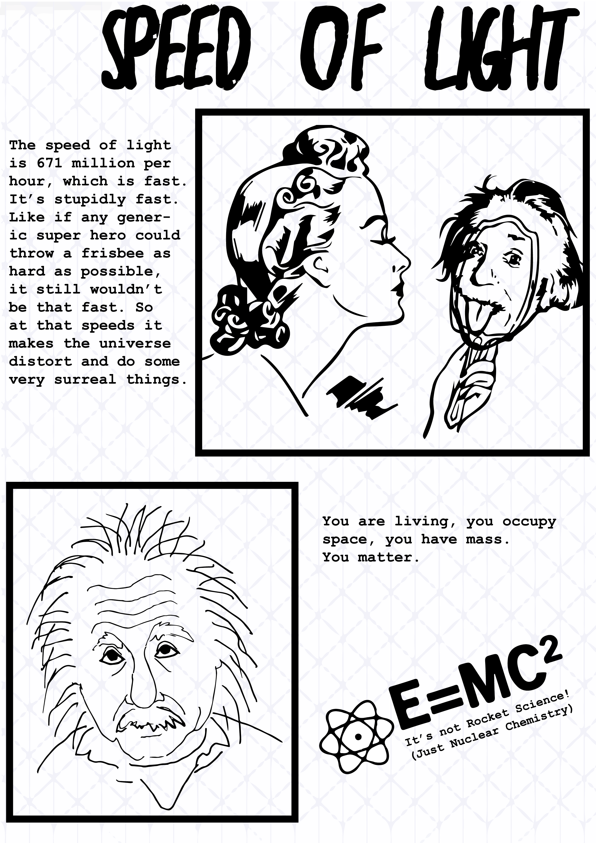
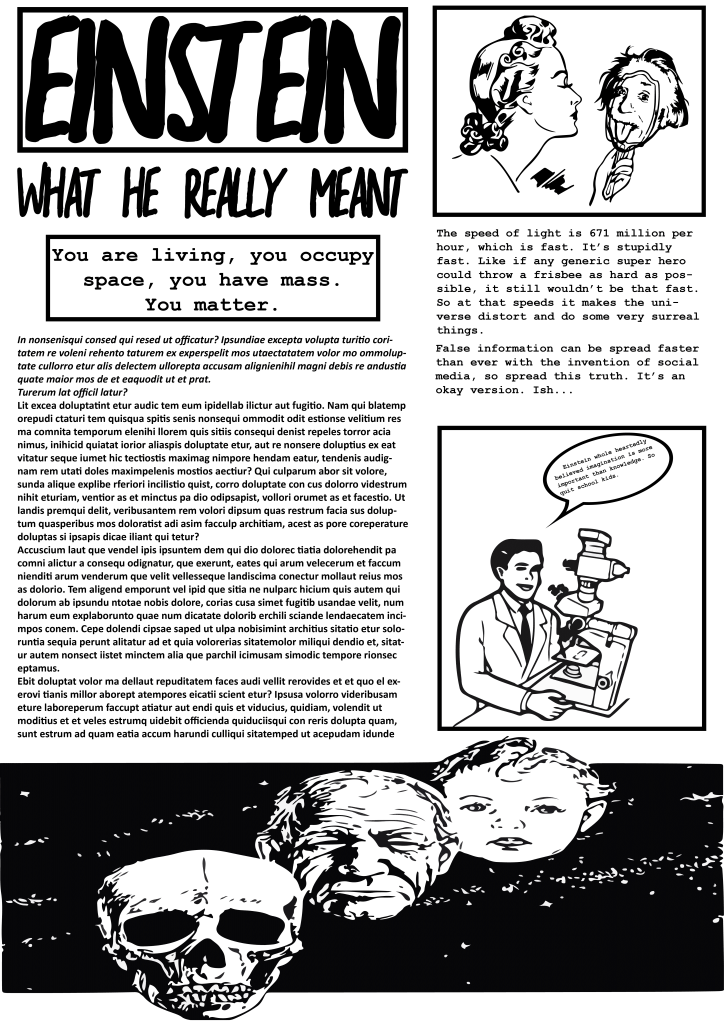
Presenting the info graphic went well, I got much needed feedback as although i finally had an idea I was struggling to fully work with it, in terms of multi format visualization anyway. Below is how the comic would look on desktop and you would just click and itd scroll to the next page.

IMG_8987 Zine12 Zine13 Zine14

And for the poster I tried to condense it but the main feedback was that it was still too word focused and not enough graphic work going on.

poster

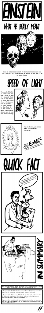
And finally my mobile version which was just an reiteration of the webcomic but in a different format. Not really much to behold and i’m going to change it entirely after feedback.

mobile

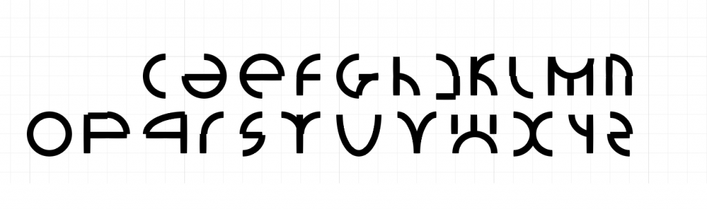
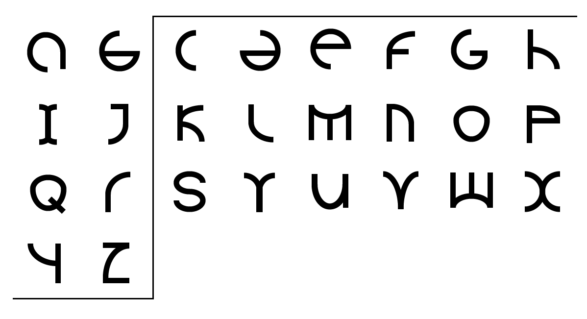
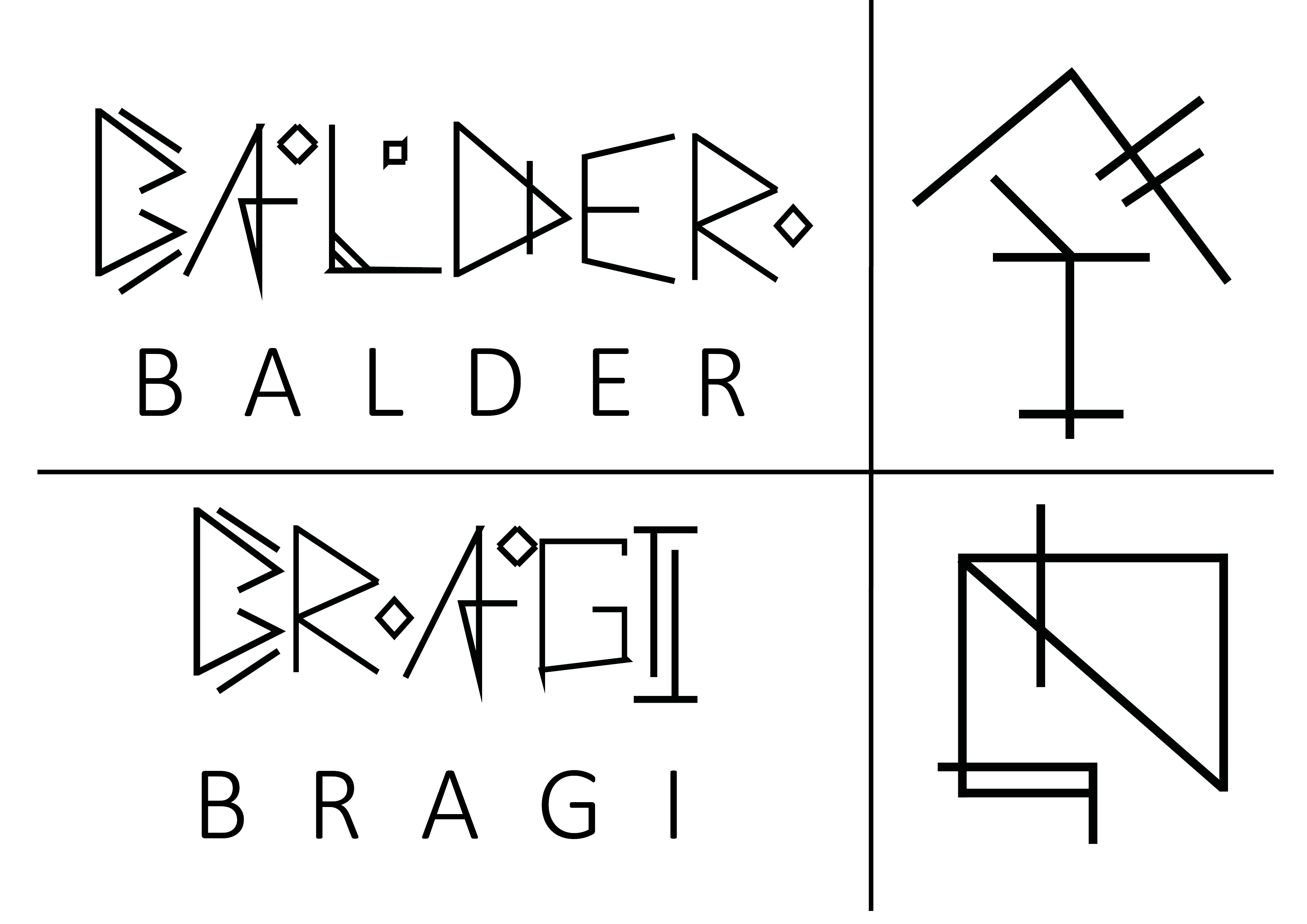
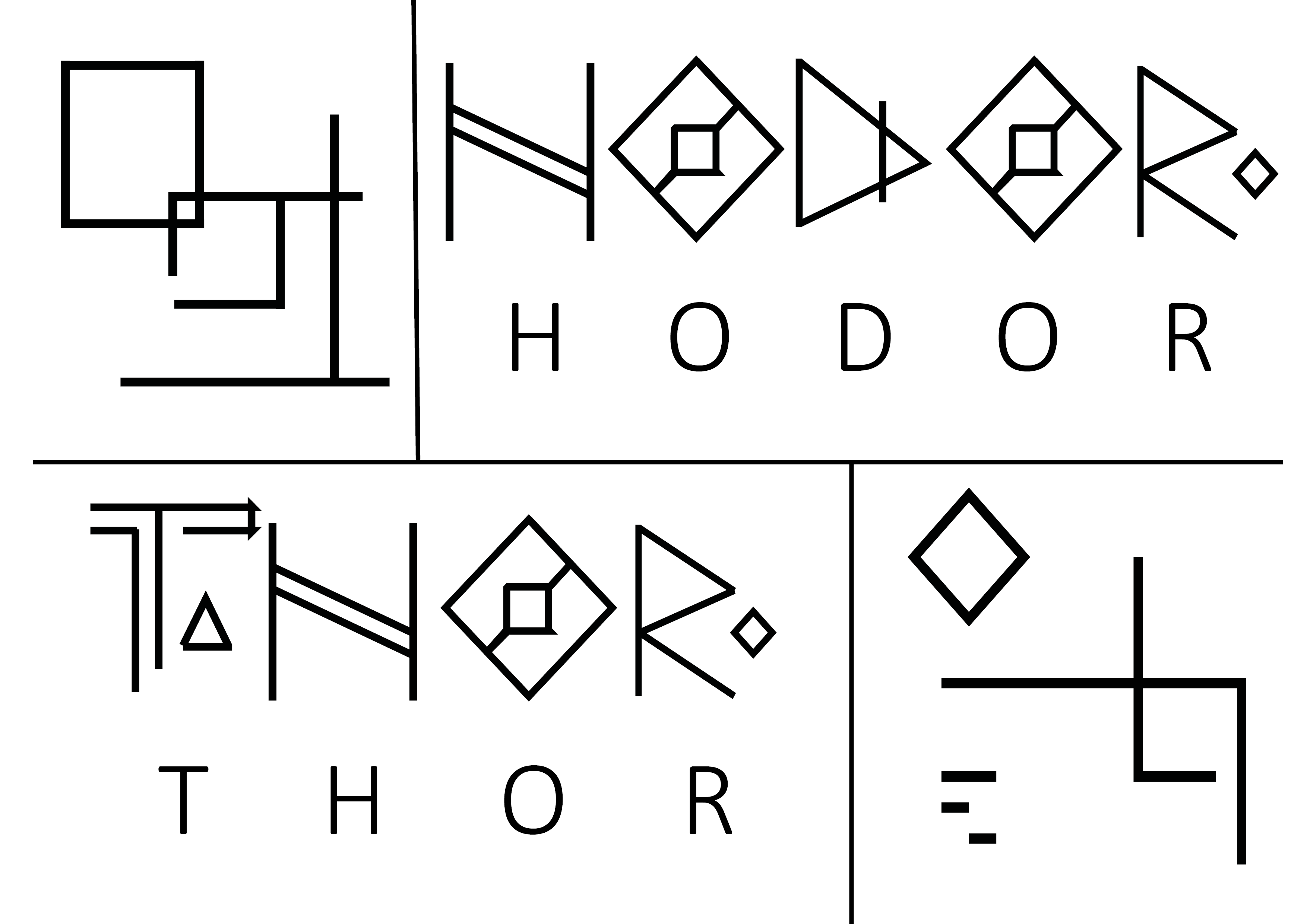
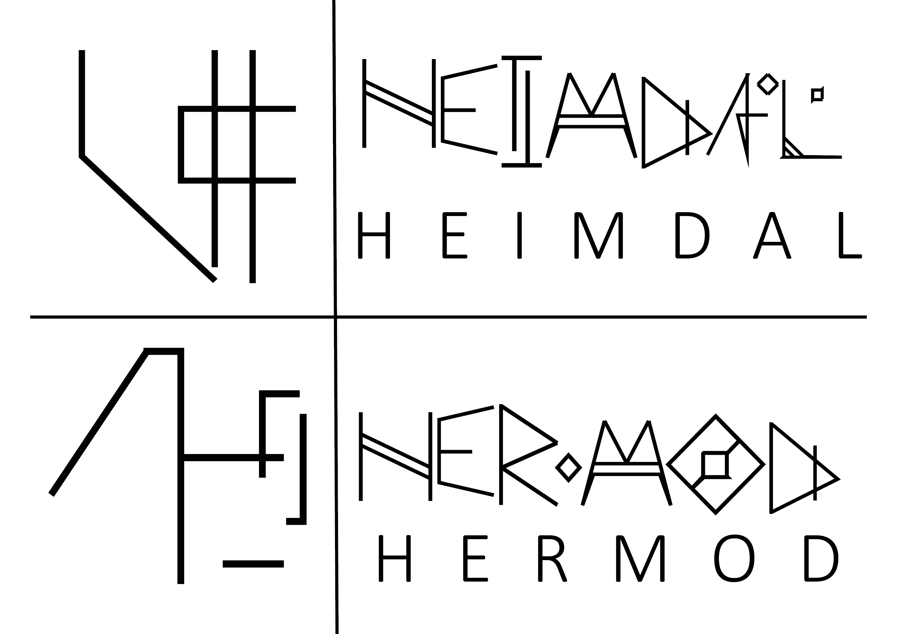
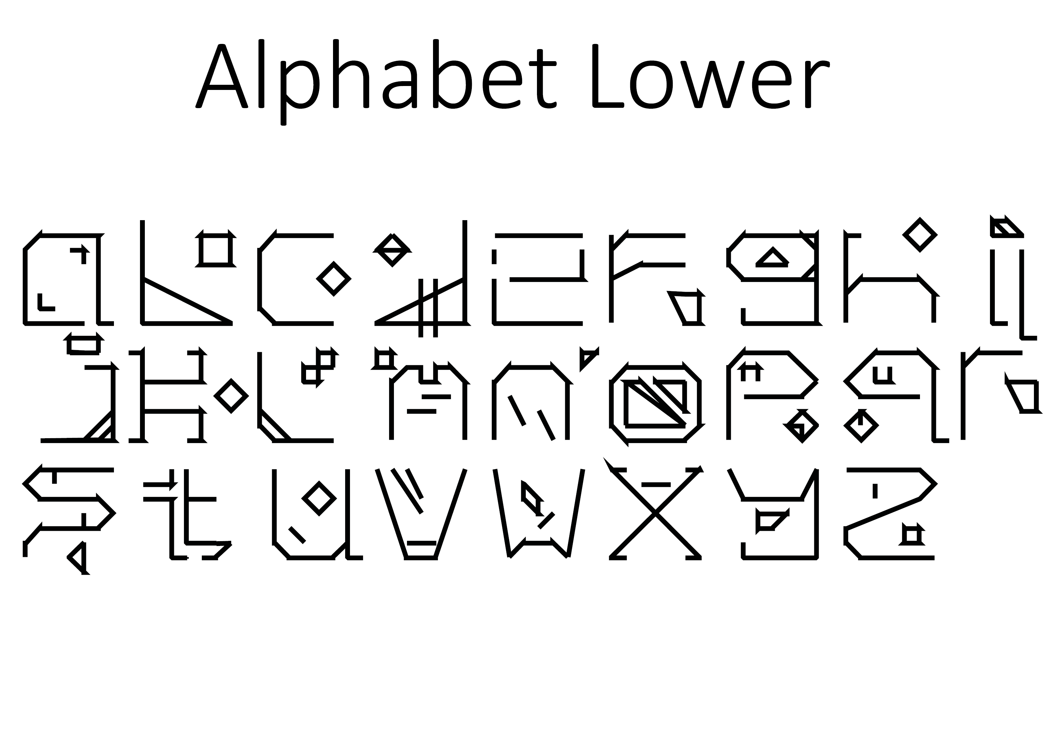
Also at around midnight the night before presentation upon reviewing my font I decided I no longer like it whatsoever and started a brand new fresh font, so I didn’t sleep before the presentation but I think I still managed to present fairly well. My new font still has basis in the viking realm but is a much more clinical and flat approach. Below isn’t the image I showed in the presentation however it is the very very first mock up. Obviously no where near complete but a slight feel can be got from it of what i’m aiming for. The reason i’m not uploading the one from the presentation is, I aren’t happy with it and am currently refining it and probably will be till the very last moment before upload.

desad

Week 6: Presentation and Feedback

The other work some people have produced in my group is outstanding, very artistic directions, really interesting inspirations and concepts I wouldn’t of come up with in a million years. It’s really interesting to see the research attached to these designs people have done too, lots of depth and lots different directions.

For my presentation I showed both upper and lower case fonts and also my practical application.

bookcover poster2


Slides8

The feedback on my practical application was to more focus on my type than the design, the practical application is there to show your type in work but mainly to show your type. Which I hadn’t really thought about before. I also presented my symbols for the gods which went down quite well, i’m very happy about that. I’m fine with public speaking however my confidence in my designs need work as I hear myself making excuses for designs rather than just discussing the designs themselves. The symbols for the gods along with their name written in my font is below. This also brought to my attention that the basic font I’ve used underneath my font is way too big and was way too big throughout my presentation. Pulled some focus from my work. Lots to work on and lots to think about.

Slides4 Slides6 Slides5

Week 5: Restructure and Preparation for Presentation.

So with the presentation for group and teacher feedback looming in the next week I’ve spent a good amount of time and a few late nights working to complete and entire alphabet both upper and lower case. The changes compared to original design are immediately apparent, dropping the carving within letter ideas and a lot less of the sharp lines. The themes however are still there the over arching runic and viking feel is there. I’ve added detailing in the forms of squares and triangles to give consistency between designs. The lower case also has a lot more detailing but that’s because in practice when typing it out the details will float between sentences giving a look to the lower case.Slides2

Slides3

Things to review:

  • Connections between letters look sloppy and it isn’t fully intentional.
  • Lower case letter Z I don’t like at all now looking at it as a whole.
  • Lower case letter O too definitely needs work.
  • I think in my haste and excitement I’ve made a quite rushed product.
  • Capital H is boring, flat and lifeless.