Week 8: Infographic Research and Idea Block

Unfortunately despite thinking about it the majority of my waking ideas i’m yet to find an idea i’m excited about. I have ideas I could do and do them to a standard that they’d at least pass but they don’t excite me. For me I feel my best work comes from when I have an idea and my blood boils so I just have to get working on it, refining it till i’m happy and i’m not usually entirely happy and knit pick my own work a lot.

I’ve looked at some fonts though that I may incorporate into my infographic just basic science style fonts, have some reference images too and vectored and Einstein face but no spark yet. I’m aware in the working world that it doesn’t matter if I am excited for a project but usually despite the brief I can make it exciting for me, still not happened yet for this.


6Tr5AMy8c

Week 7: Beginning of Multi-Format/Inforgraphic

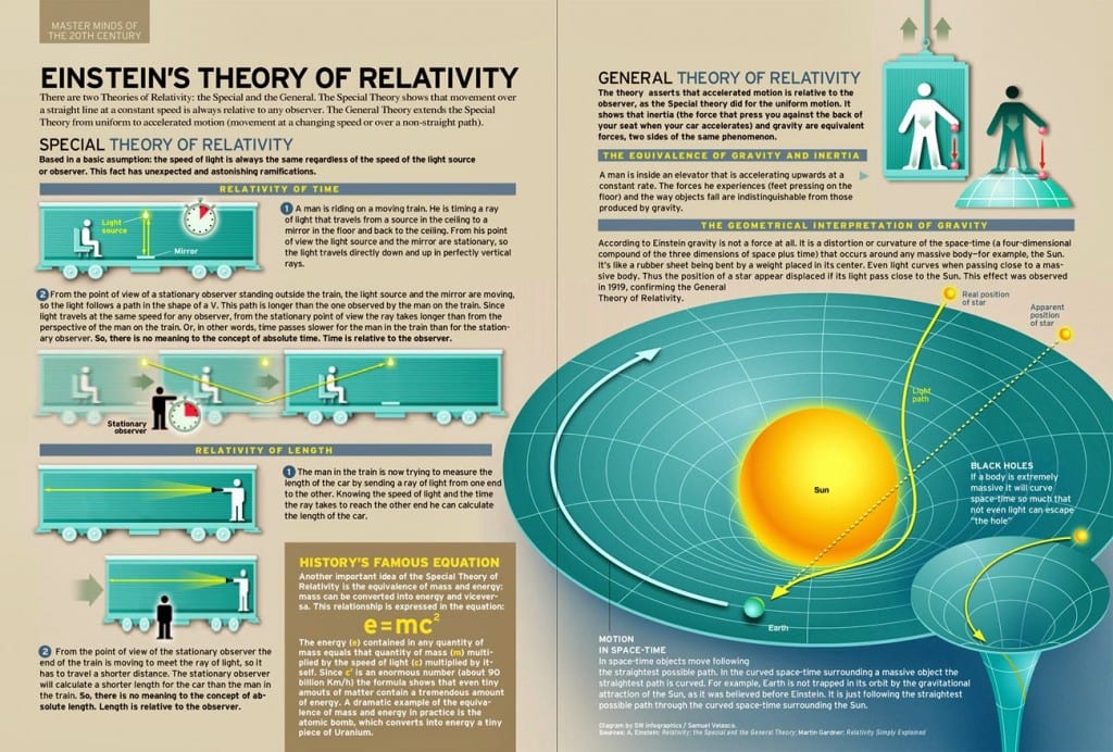
This week we had our second brief explained to us. It’s to create a set of infographics for different screen sizes and media types. The infographic however is covering Einsteins Theory Of Relativity, I understand the brief and why it’s laid out how it is, it’s to train us in the ways a company or client would give us a task and with having studied physics in college i’m hoping to be able to apply some knowledge here. However translating it into minimal words and more pictures I feel may be an issue. Initial research found some great infographics, this one in particular I focused on a lot.

theory-relativity

I like the different manners of design going on, the flat 2d integrated with 3d, the colour schemes throughout looks professional and informative.

Week 6: Presentation and Feedback

The other work some people have produced in my group is outstanding, very artistic directions, really interesting inspirations and concepts I wouldn’t of come up with in a million years. It’s really interesting to see the research attached to these designs people have done too, lots of depth and lots different directions.

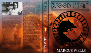
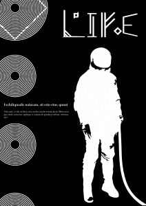
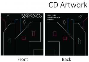
For my presentation I showed both upper and lower case fonts and also my practical application.

bookcover poster2


Slides8

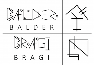
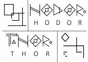
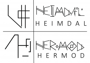
The feedback on my practical application was to more focus on my type than the design, the practical application is there to show your type in work but mainly to show your type. Which I hadn’t really thought about before. I also presented my symbols for the gods which went down quite well, i’m very happy about that. I’m fine with public speaking however my confidence in my designs need work as I hear myself making excuses for designs rather than just discussing the designs themselves. The symbols for the gods along with their name written in my font is below. This also brought to my attention that the basic font I’ve used underneath my font is way too big and was way too big throughout my presentation. Pulled some focus from my work. Lots to work on and lots to think about.

Slides4 Slides6 Slides5

Week 5: Restructure and Preparation for Presentation.

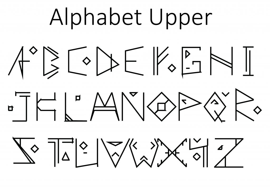
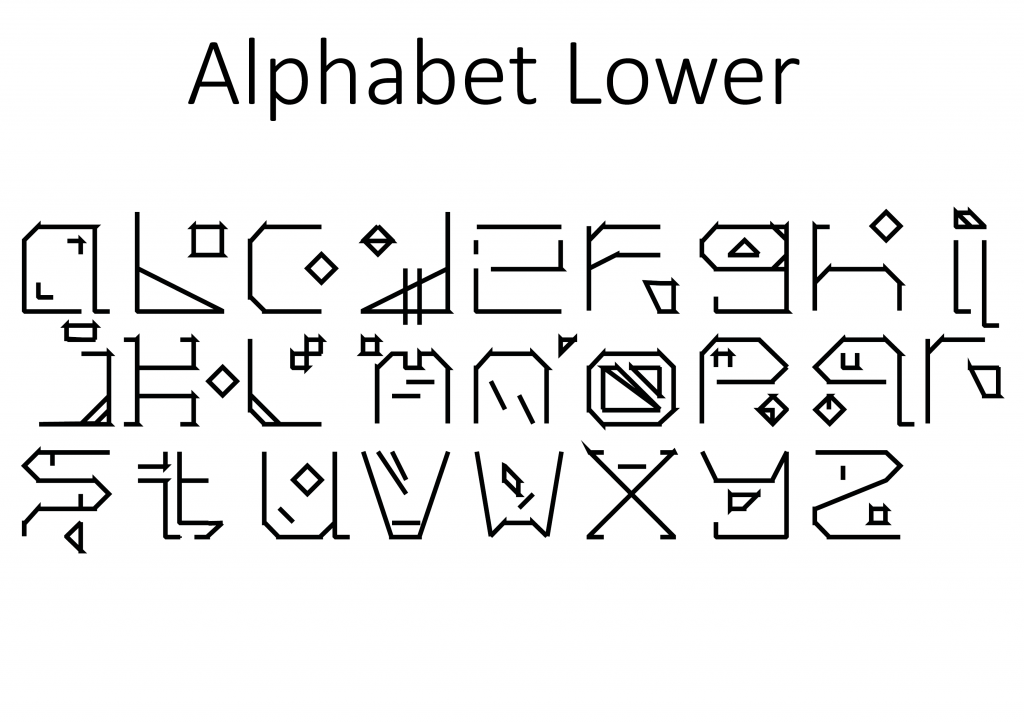
So with the presentation for group and teacher feedback looming in the next week I’ve spent a good amount of time and a few late nights working to complete and entire alphabet both upper and lower case. The changes compared to original design are immediately apparent, dropping the carving within letter ideas and a lot less of the sharp lines. The themes however are still there the over arching runic and viking feel is there. I’ve added detailing in the forms of squares and triangles to give consistency between designs. The lower case also has a lot more detailing but that’s because in practice when typing it out the details will float between sentences giving a look to the lower case.Slides2

Slides3

Things to review:

  • Connections between letters look sloppy and it isn’t fully intentional.
  • Lower case letter Z I don’t like at all now looking at it as a whole.
  • Lower case letter O too definitely needs work.
  • I think in my haste and excitement I’ve made a quite rushed product.
  • Capital H is boring, flat and lifeless.

Week 4: More Mocks Ups and Style Ideas

Further research into Viking art particularly the ships I’ve found the detailing on the side of boats really intriguing. The image I found is a modern interpretation but is based on carvings found on still standing today Viking structures. For example..


david-lomax-detail-of-the-replica-of-a-9th-century-ad-viking-ship-oseberg-norway-scandinavia-europe


I find the intricate patterns and the space design within design really intriguing the carving has several level of depth giving it a prominent look yet still almost a 3-d feel to it. Shown below is a more updated version of what I had started the previous week, I have thickened the lines and corrected some mistakes I saw also began playing around with the idea of incorporating the carving look to it.

DES0202

Errors to fix upon review.

  • Spacing between letters
  • The stem of the B is the wrong size
  • No sense of flow between the curves on B
  • Way too many harsh joints
  • The points on the C are not sharp where as all others are.