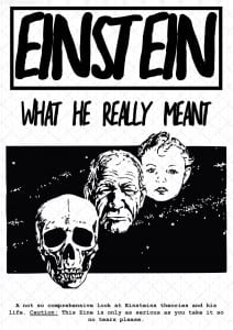
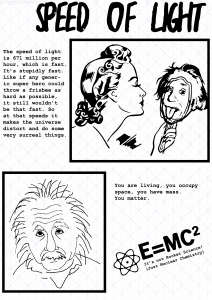
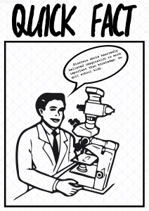
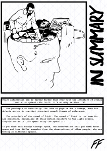
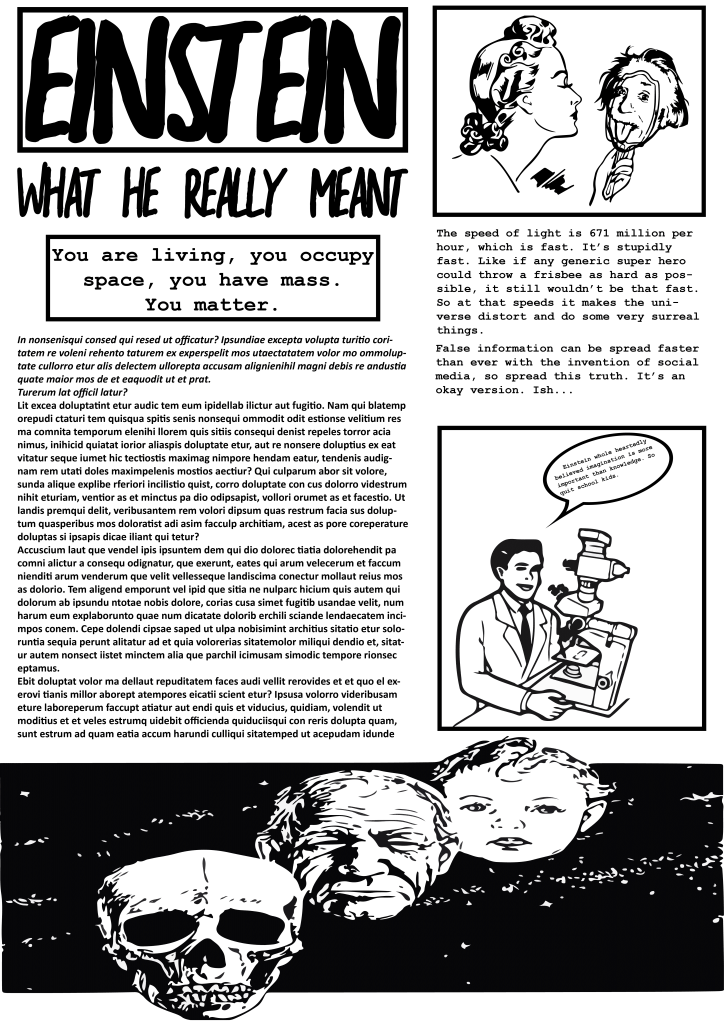
Presenting the info graphic went well, I got much needed feedback as although i finally had an idea I was struggling to fully work with it, in terms of multi format visualization anyway. Below is how the comic would look on desktop and you would just click and itd scroll to the next page.
And for the poster I tried to condense it but the main feedback was that it was still too word focused and not enough graphic work going on.
And finally my mobile version which was just an reiteration of the webcomic but in a different format. Not really much to behold and i’m going to change it entirely after feedback.
Also at around midnight the night before presentation upon reviewing my font I decided I no longer like it whatsoever and started a brand new fresh font, so I didn’t sleep before the presentation but I think I still managed to present fairly well. My new font still has basis in the viking realm but is a much more clinical and flat approach. Below isn’t the image I showed in the presentation however it is the very very first mock up. Obviously no where near complete but a slight feel can be got from it of what i’m aiming for. The reason i’m not uploading the one from the presentation is, I aren’t happy with it and am currently refining it and probably will be till the very last moment before upload.

