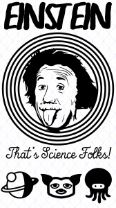
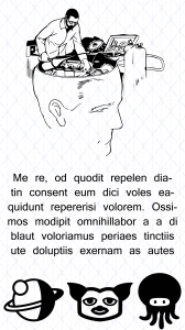
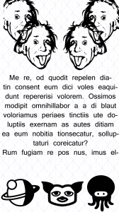
The app was a simple matter of looking at it as an app for mobile devices rather than just a screen size, i’m quite happy with the result. Obvious pull from a looney tunes inspiration for the first screen and the rest although with placeholder text I feel the design is there.
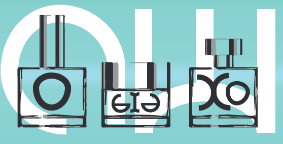
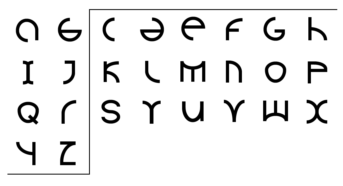
And finally with my font here is the final practical applications and typographic alphabet.

