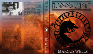
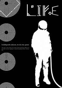
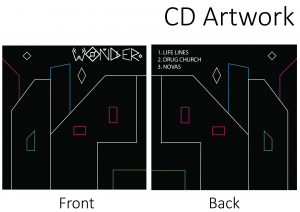
The other work some people have produced in my group is outstanding, very artistic directions, really interesting inspirations and concepts I wouldn’t of come up with in a million years. It’s really interesting to see the research attached to these designs people have done too, lots of depth and lots different directions.
For my presentation I showed both upper and lower case fonts and also my practical application.
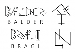
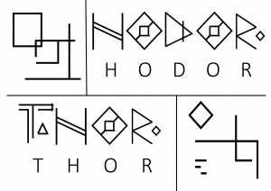
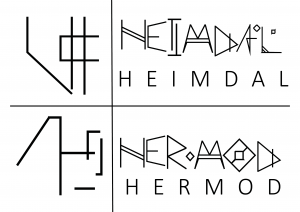
The feedback on my practical application was to more focus on my type than the design, the practical application is there to show your type in work but mainly to show your type. Which I hadn’t really thought about before. I also presented my symbols for the gods which went down quite well, i’m very happy about that. I’m fine with public speaking however my confidence in my designs need work as I hear myself making excuses for designs rather than just discussing the designs themselves. The symbols for the gods along with their name written in my font is below. This also brought to my attention that the basic font I’ve used underneath my font is way too big and was way too big throughout my presentation. Pulled some focus from my work. Lots to work on and lots to think about.

