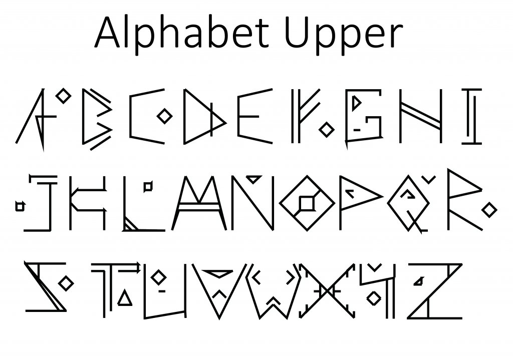
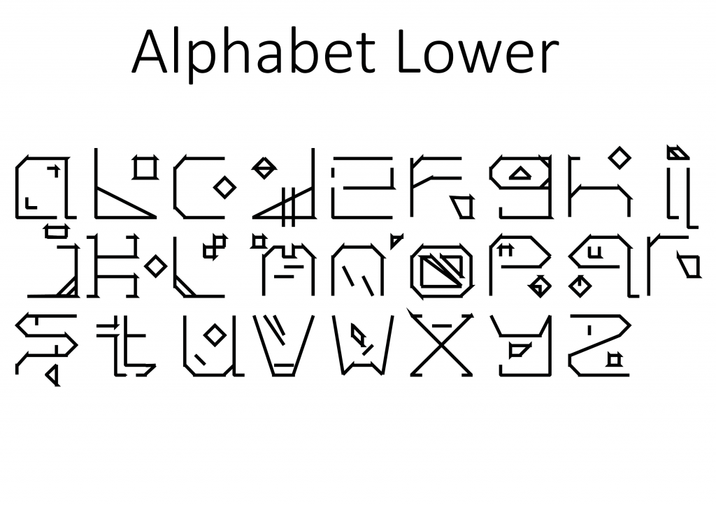
So with the presentation for group and teacher feedback looming in the next week I’ve spent a good amount of time and a few late nights working to complete and entire alphabet both upper and lower case. The changes compared to original design are immediately apparent, dropping the carving within letter ideas and a lot less of the sharp lines. The themes however are still there the over arching runic and viking feel is there. I’ve added detailing in the forms of squares and triangles to give consistency between designs. The lower case also has a lot more detailing but that’s because in practice when typing it out the details will float between sentences giving a look to the lower case.
Things to review:
- Connections between letters look sloppy and it isn’t fully intentional.
- Lower case letter Z I don’t like at all now looking at it as a whole.
- Lower case letter O too definitely needs work.
- I think in my haste and excitement I’ve made a quite rushed product.
- Capital H is boring, flat and lifeless.

